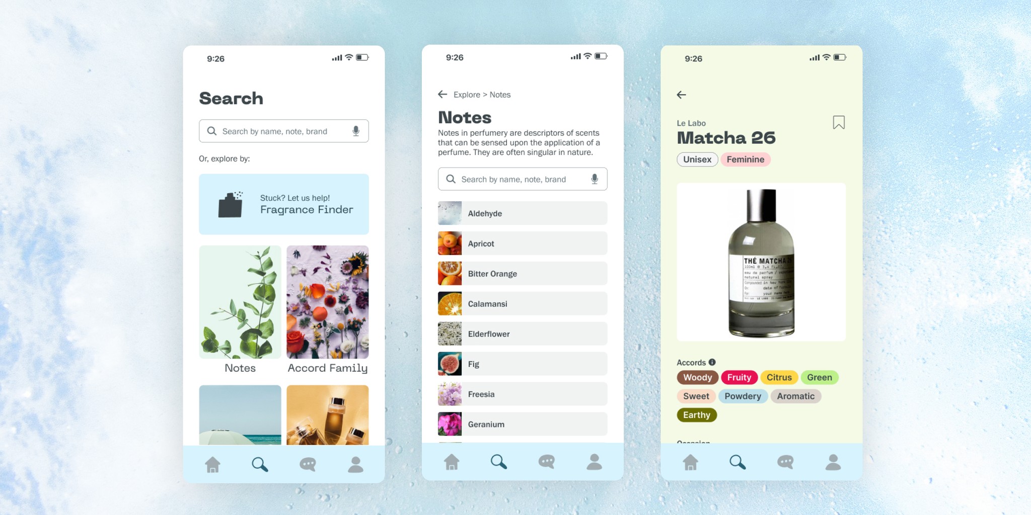
Aromatica Fragrance
How do we depict the intangible?
MY ROLE
Product Designer
PRODUCT
Mobile App
COMPANY
Aromatica
BACKGROUND
Smelling good, feeling good
Fragrance is a huge market, with a worth approaching $69 billion by the year 2030. It's been part of human beauty routines as long as we've existed, yet we're still dealing with websites that look like they were built in the 1990s.
As a frequent pursuer of these websites, I felt there was an opening for a mobile app that was focused on fragrance. It would build off of traditional fragrance knowledge, but still be approachable for the everyday person. The fragrance world is a deep rabbit hole, and this app could be what helped to demystify a lot of it.
RESEARCH
(Not so) Competitive Analysis
As always, research is a solid foundation to build off of when building something new. As someone who has extensively researched the subject though, I knew there weren't a ton of quality competitors out there. But there is still something to learn from all competitors, even if it's NOT what to do. So I dug into reddit and social media and picked the top three sites that popped up as popular references:
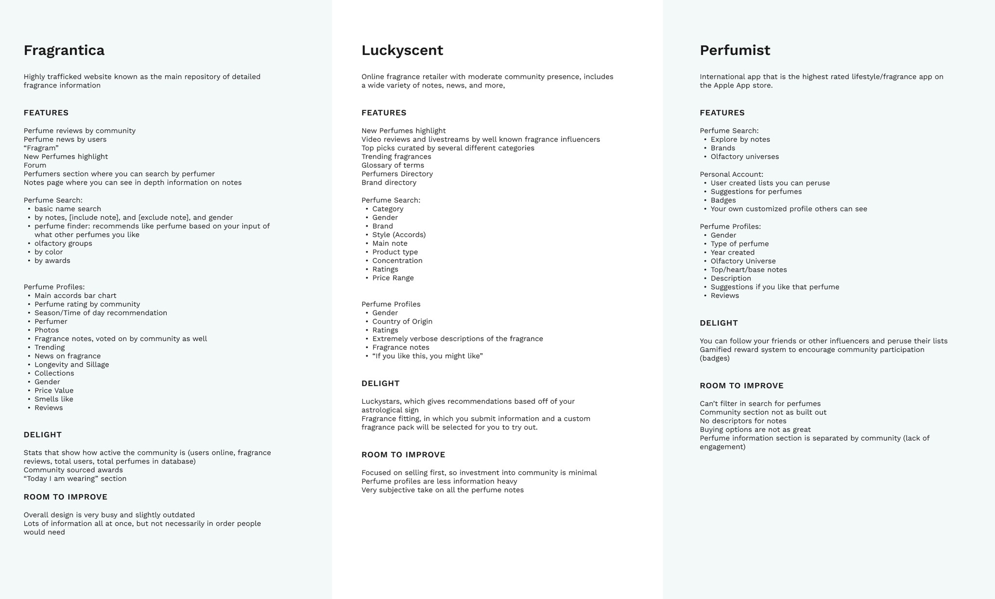
The research help to shape ideas about what the base of the app should be, making sure to include common features (and building upon areas where they were lacking)
USER INTERVIEWS
Fragrance aficionados unite
I wanted to talk to people who were into fragrance, however slight OR strong their interest was. I recruited a set of interviewees who were all somewhat familiar with fragrances, and got their thoughts on their experiences with fragrances. The key themes that emerged would inform the next part of the process.
the importance of research, review, and prep
Research plays a big part in searching for a new fragrance: it’s often how interviewees got to their current knowledge level. Extra features like filters, user reviews, and categories helped interviewees helped even more.
knowing the basics
Most interviewees noted that they knew what they considered the basics, but they couldn’t quite conceptualize what a fragrance smelled like. This gap in knowledge meant they didn't feel quite confident purchasing fragrances.
utility: how much use will I get out of this fragrance?
Interviewees noted that due to the cost of fragrance, they liked their choices to be as useful as possible: specifically calling out they preferred fragrances that had multiple use-cases (daily wear that could transition to a date night, for example)
USER PERSONA
The curious hobbyist
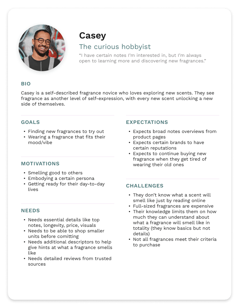
From the insights gathered, I created a user persona to help guide my design directions.
Casey is no expert, but they dabble in the fragrance world. They know a bit of what they like, and are motivated by smelling good (both to themselves and others). But they don't have the depth of knowledge to know what fragrances could entirely smell like, nor the general idea of how to search for new ones they ike.
IDEATION
What exactly should we be tackling here, though?
After taking a look at the pain points outlined by interviewees, I kicked off my ideation phase by highlighting certain questions to help explore solutions:
How might we depict the intangible qualities of fragrance?
How might we increase confidence amongst fragrance purchasers?
What are users looking for in a fragrance (and how might we showcase that?)
INFORMATION ARCHITECTURE
Building out the app
Since this was a new app, I started by creating the scaffolding that all of this would sit on.

I started off with a site map to plan out what pages were needed for the flows I had in mind.
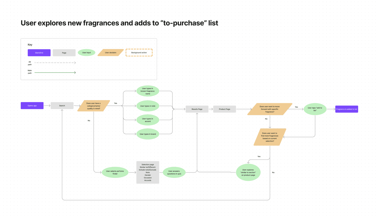
Using the site map as a guide, I planned out a user flow that would highlight the most essential parts of the app.
LO-FI WIREFRAMES
Building the basics
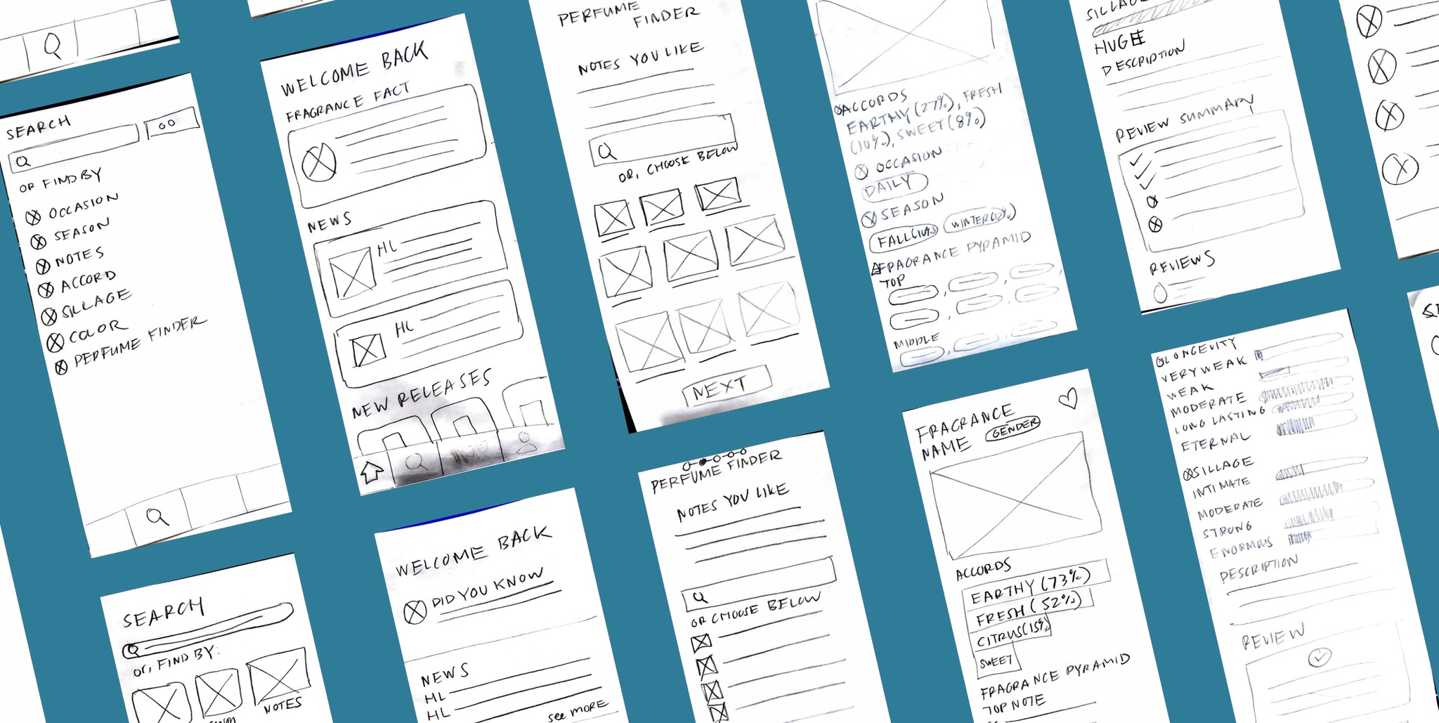
WIth the task flows guiding my design choices, I sketched out a few screens. The aim of this part of the process was to quickly iterate on my key screens in order to move on to testing. With a couple of options, I felt like I had enough to move onto mid-fidelity wireframes.
MID-FIDELITY WIREFRAMES
Creating the building blocks
Since a key goal of the app is to depict an informationally dense subject, I decided I needed to explore the depictions in mid-fidelity to test at that level before moving on to high-fidelity designs. I set up my wireframes, building out the structure more fully. I also set up a working prototype in order to move on to testing.
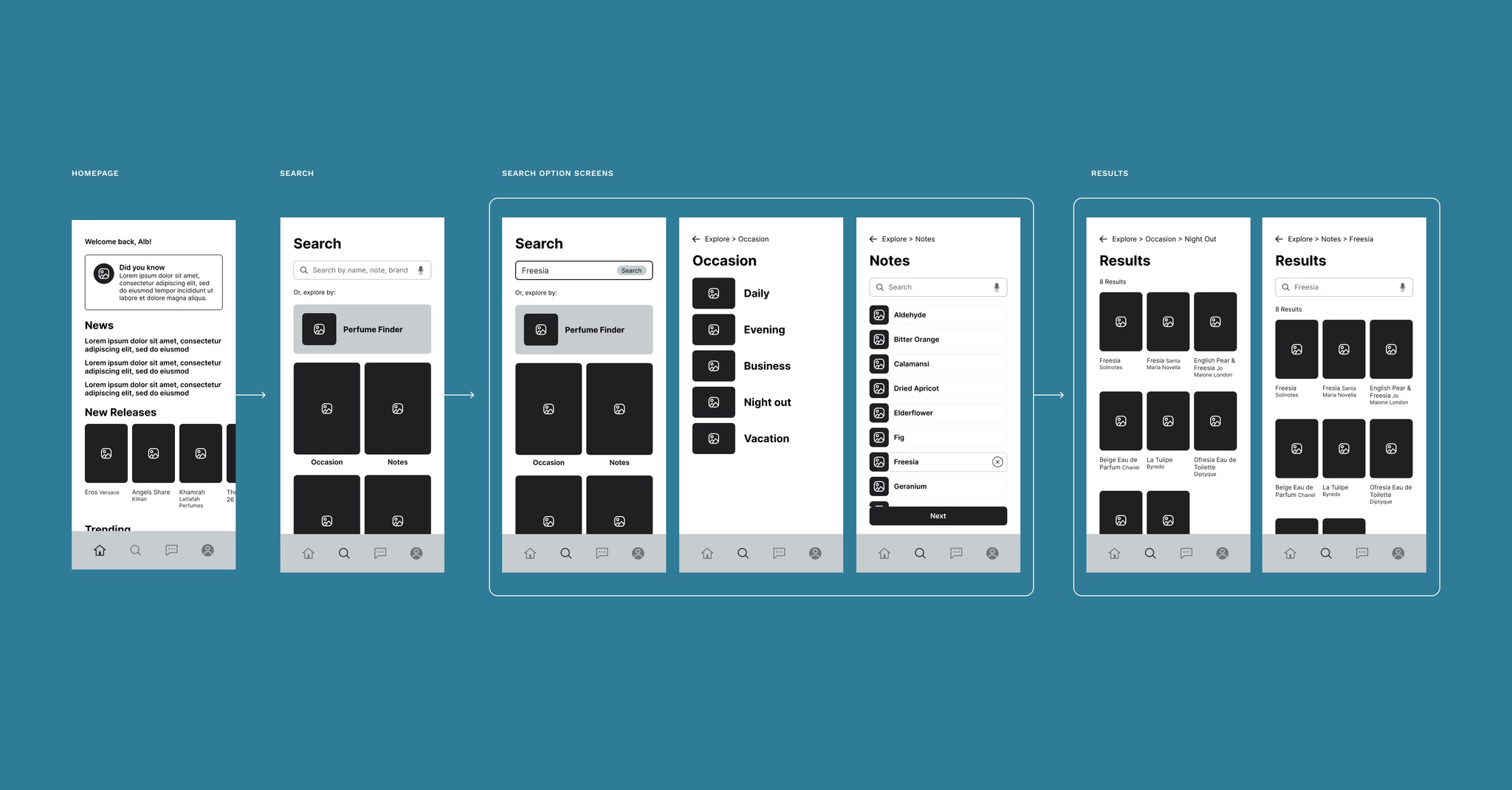
Beginning screens include home, search, and results
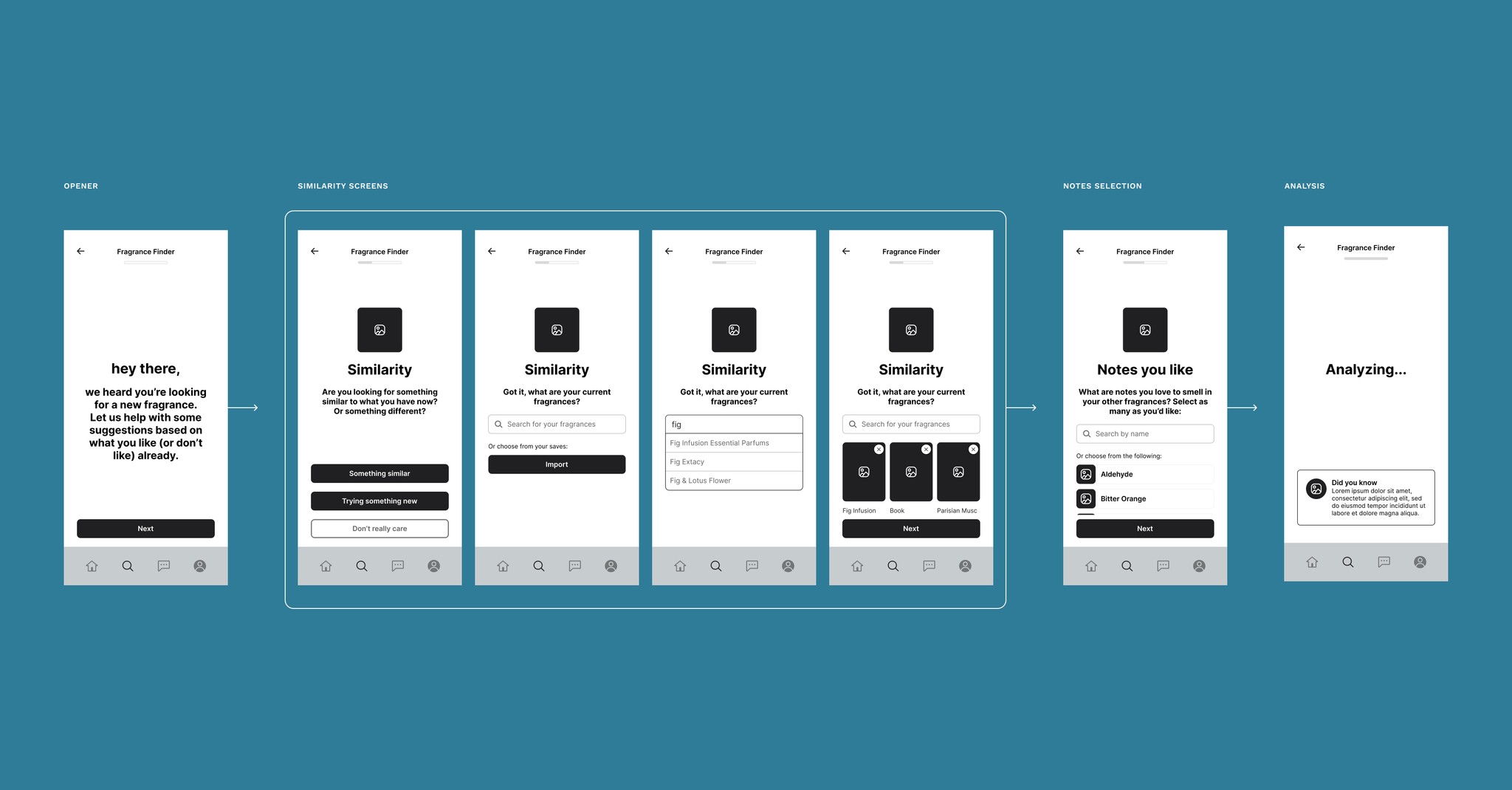
Fragrance Finder screens
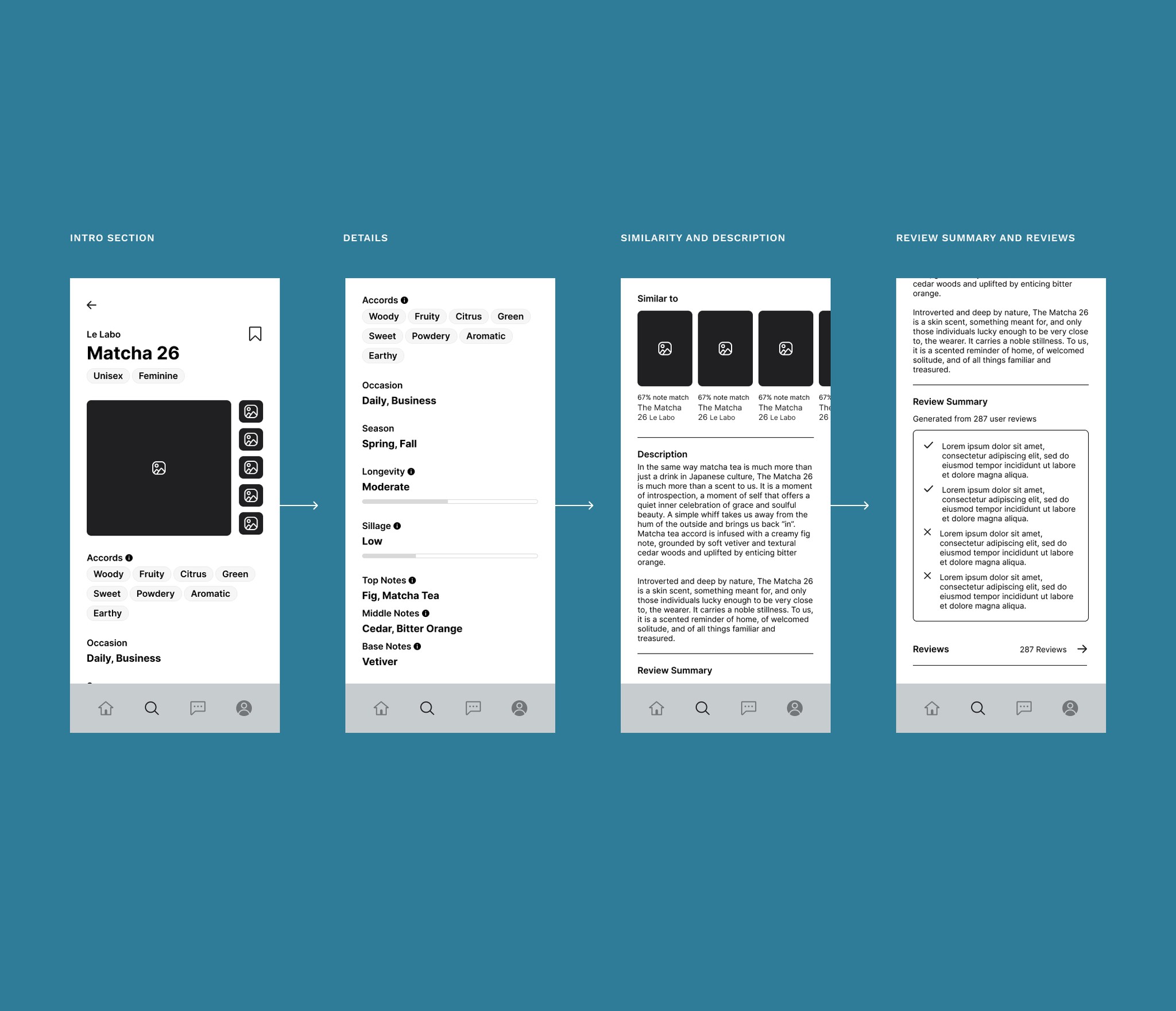
Screens for the product details
TESTING AND ITERATION
Incorporating user feedback
After sharing the mid-fi prototypes for reviews, users had some feedback. I took the most common issues and adjusted my prototypes to account for the solutions.
Some users pointed out that the way the categories were set up were not very clear
⬇️
Rewording the names and adding images helped with understanding
Some users didn't quite understand what the Fragrance Finder was for or it's capabilities
⬇️
The module and opening screens added extra explainer copy to help clear what the capabilities were added
Users wanted more robust filtering options when it came to fragrance results
⬇️
Added additional filtering options, such as brand, gender, and popularity
HI FI PROTOTYPES
Putting it all together
After addressing all user feedback, I created my screens in hi-fidelity for user testing.
Back to projects
