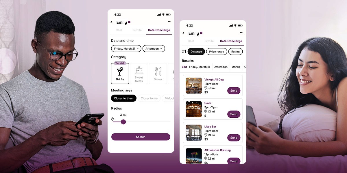
Date Concierge
How might we ease the mental load for burnt out daters?
MY ROLE
UX Designer
TOOLS
Figma
COMPANY
Hinge
BACKGROUND
Times are tough for those seeking love
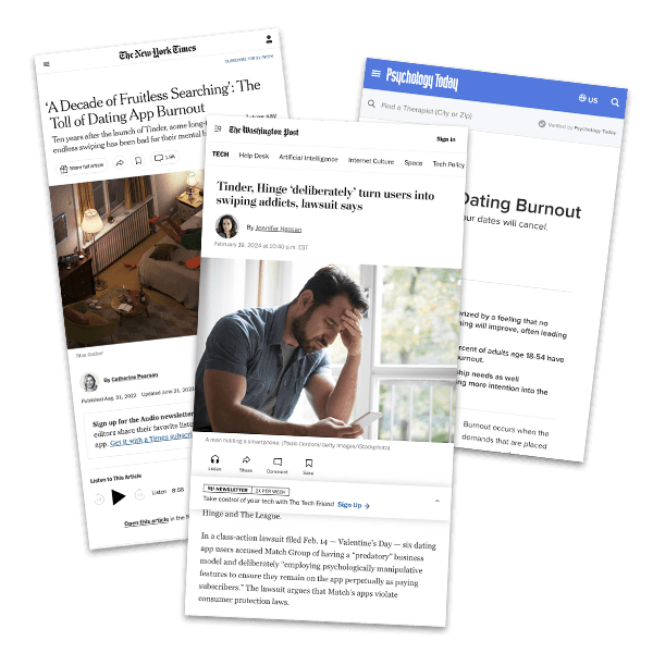
Dating culture in the US is in a transitional period, as many people are reporting feelings of burnout around the dating scene. Online dating is painted as an overall exhausting experience for everybody involved.
Hinge has been accused of intentionally messing with their algorithm, and Dating apps need to reassess features to increase customer satisfaction and keep subscribers.
REVIEWING THE COMPETITION
It’s crowded up in here
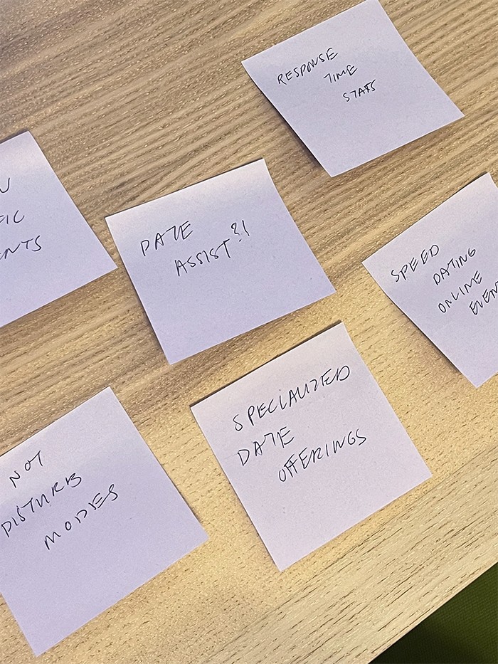
I begun with research on competitors. It’s a crowded market, with the top performers offering a variety of approaches for users to try and find their match.
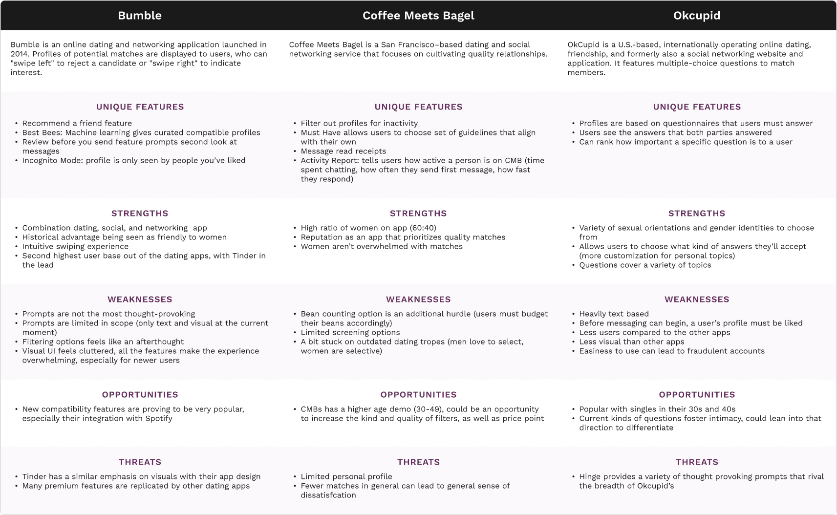
Many apps featured similar features—the base of a profile seems to often be images and question-answering. Other features are helpful in offering more novel information: for example, Coffee Meets Bagel gives users statistics on how quickly a match will answer incoming message.
All of this is more and more information to sift through though—and decision fatigue plays a huge part in the process. My hunch was that this was a problem space that could lead to value-adding solutions. With this in mind, I shifted to user interviews to dive into it more.
USER INTERVIEWS
Spilling the tea with Hinge users
I interviewed a variety of Hinge users next, hoping to capture some of their thoughts on the app and their own processes. Users had a lot to say, with some things being positive:
Values
Users saw Hinge as a place for value-focused daters who knew what they wanted
Consideration
Users placed an emphasis on being considerate daters
Openness
Users were open about wanting to connect and meet like-minded people
And others...not so much:
Adversarial stance
Users felt Hinge did not actually want them to meet someone
Paywall
Users felt Hinge purposefully hid potential matches behind paywalls
Time
Many actively limited their time on their app, otherwise frustrations would mount
In short:
Hinge had a reputation for being an app where people were serious about going on dates and seeking relationships....
....yet users also felt the app was actively getting in their way of connecting with people, and intentionally limited their time on the app.
USER PERSONA
The earnest seeker
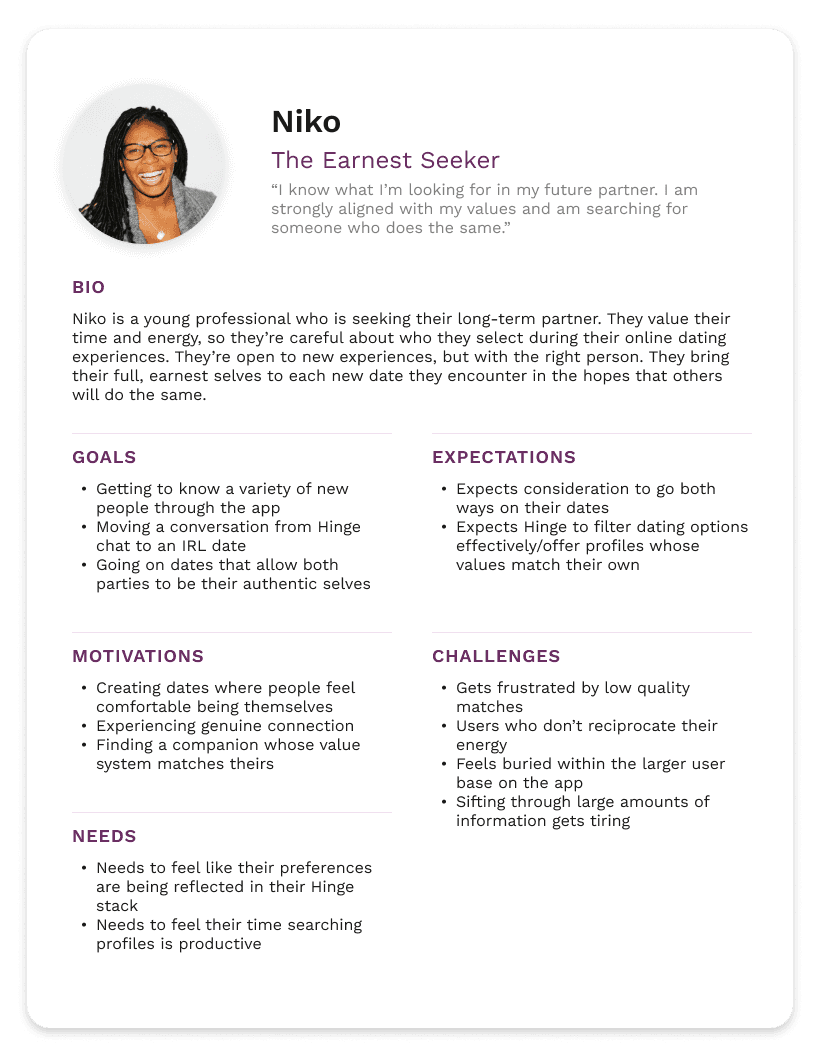
From the insights gathered, I created a user persona to help guide my design directions.
Niko is someone whose approach to dating is intentional and earnest, but is running into challenges on their journey to finding their person.
IDEATION
But what are we going to do about it?
After taking a look at the pain points outlined by interviewees, I kicked off my ideation phase by highlighting certain questions to help explore solutions:
How might Hinge add value to the date-making process?
How might we lighten some of the mental load for users?
How might we dispel the notion that Hinge does not want to actually help their userbase?
THE FEATURE
Date Concierge
After combing through the user interviews and mulling over my guiding questions, I conceptualized Date Concierge: a feature that would offer suggestions for date ideas based on inputs like preferred activity, distance from users, and more.
This feature:
✔
Adds value by offering new options for people to check out
✔
Lightens the mental load by taking a lot of the guesswork out of finding new places
✔
Highlights the positive intent Hinge has towards their users as a feature that directly helps support the fostering of new connections
INFORMATION ARCHITECTURE
How it gets incorporated into existing Hinge architecture
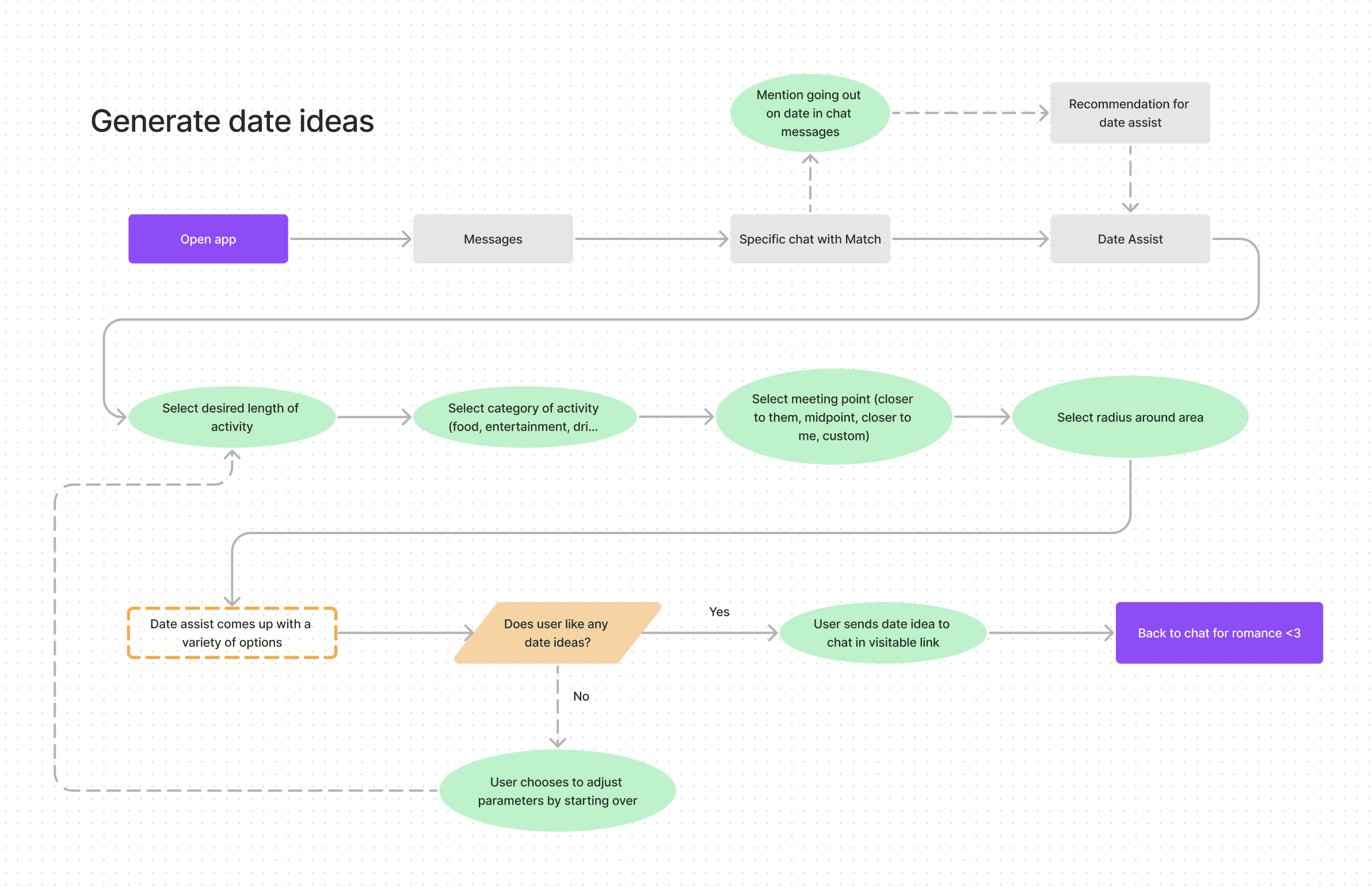
Being a new feature, I moved on to creating some task flows to highlight what new screens I would need to build.
LO-FI WIREFRAMES
Getting sketchy with it
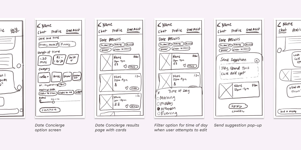
WIth the task flows guiding my design choices, I sketched out a few screens. The aim of this part of the process was to quickly iterate on my key screens in order to move on to testing. From these screens I set up a lo-fi prototype to check out basic usability.
TESTING AND ITERATION
Incorporating user feedback
After sharing the lo-fi prototypes for reviews, users had some points of friction. I took the most common issues and adjusted my prototypes to account for the solutions.
Users pointed out some of the initial options to filter didn't make sense, such as the "time" filter
Removing the time filter and streamlining the rest addressed this issue
Users reported confusion around copy used within the prototypes, which led them to second guess their decisions
Copy was revisited in order to make the actions as clear as possible for the user
Some users noted they wished they could sort more effectively
More specific sorting options were added to the results screens
HI FI PROTOTYPES
Putting it all together
After addressing all user feedback, I created my screens in hi-fidelity for user testing.
Date Concierge is placed in a prime location, close to the chat feature
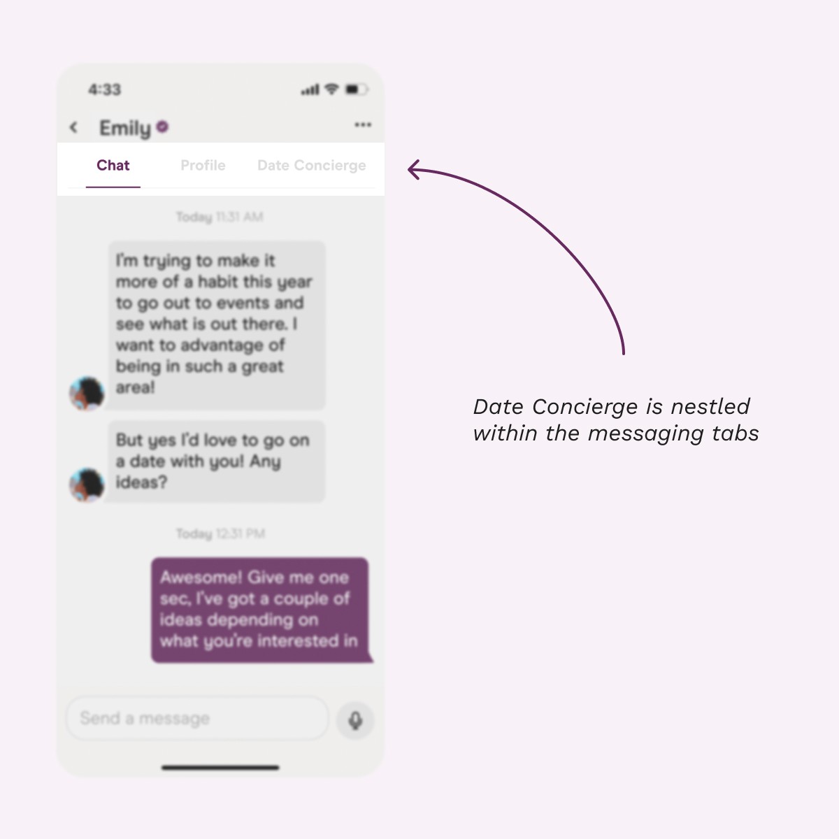
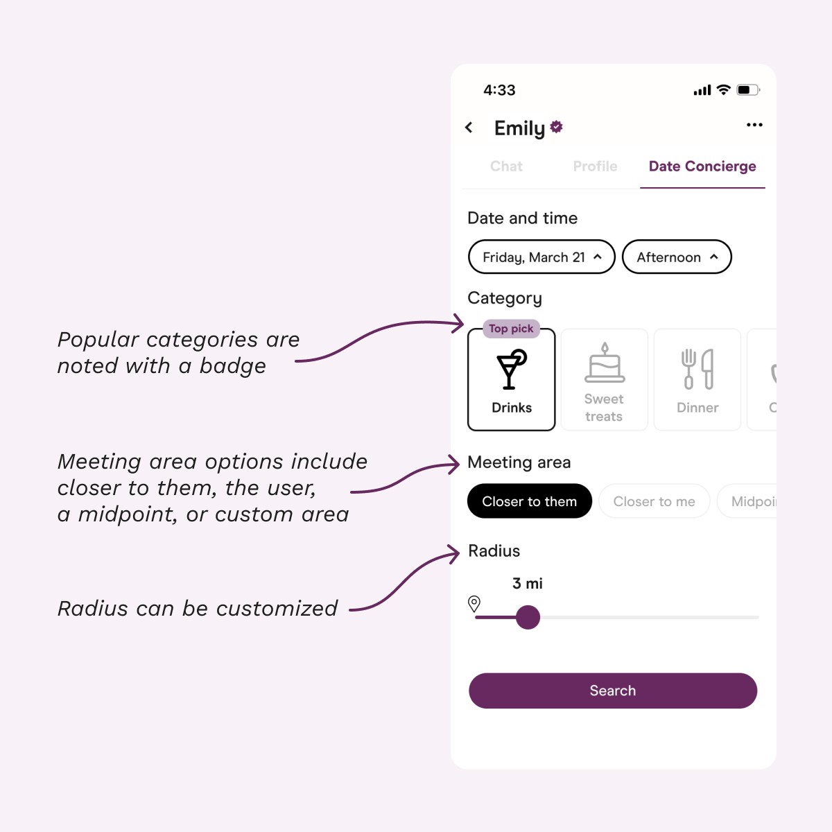
The Date Concierge tab shows an initial selection screen, with a variety of options for the date the user has in mind
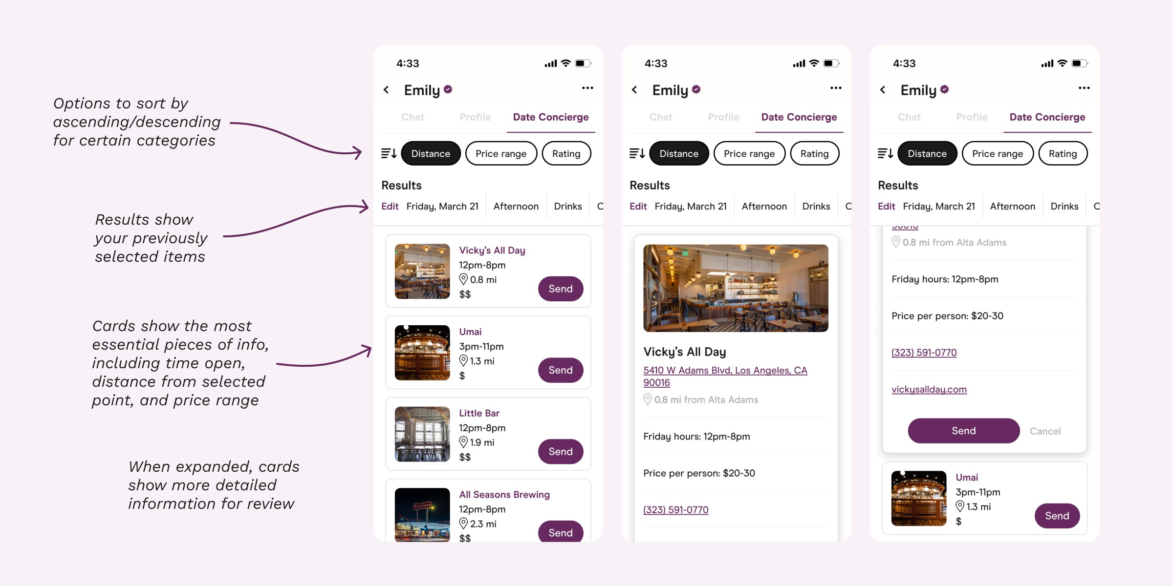
Once the user selects all their criteria, they are brought to the results screen, where offerings are filtered by their previous selections
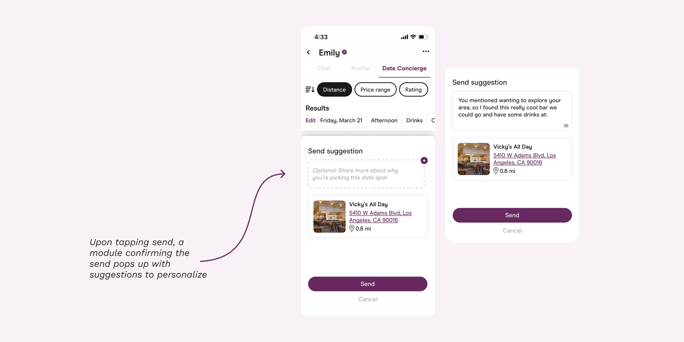
When the "send" button is selected, a suggestion module pops up, offering the chance to explain their reasoning
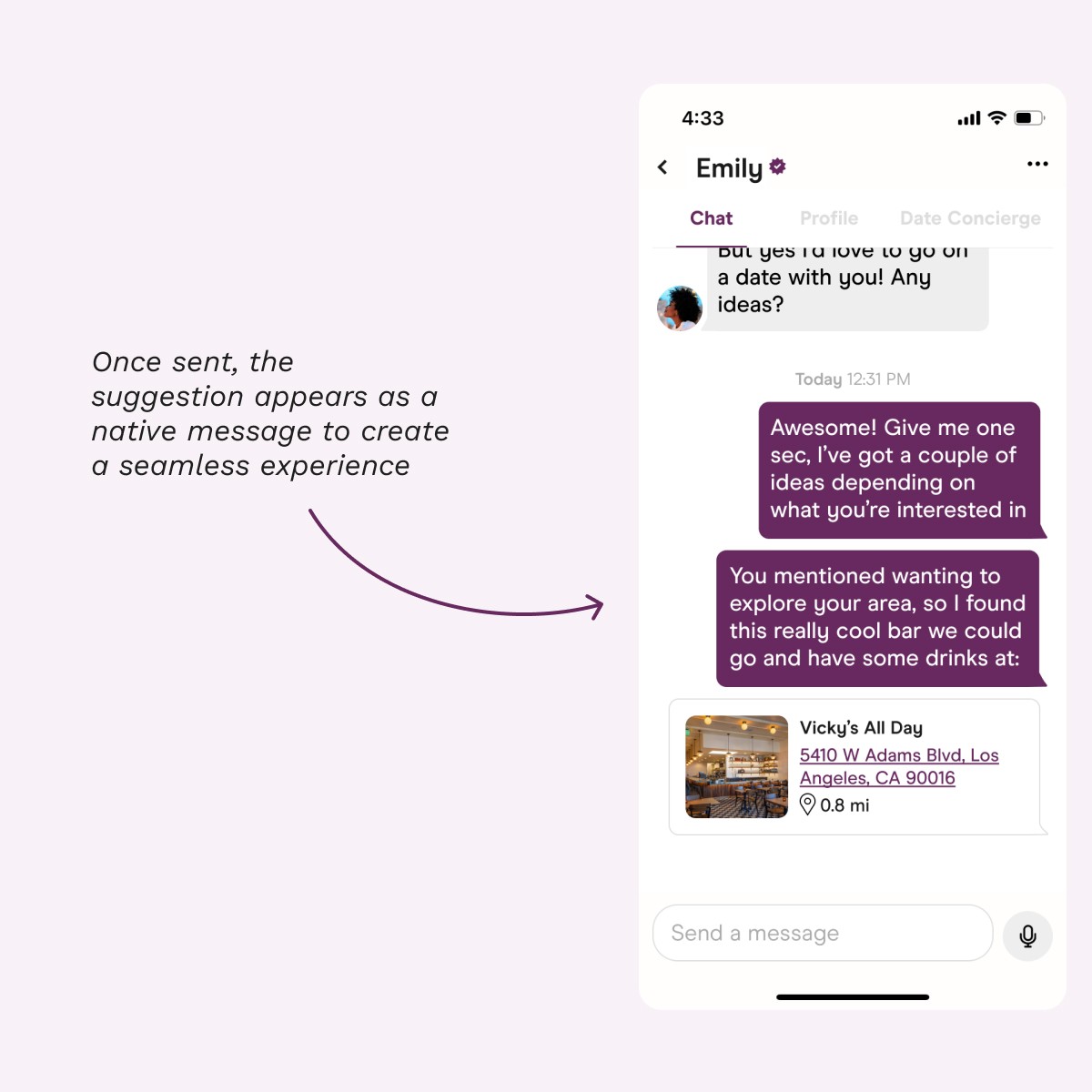
The date idea gets sent to the user's chat with their match, integrated with the rest of the messages
NEXT STEPS
For the future
This project was full of learnings, and with the creation of the prototype came even more ideas to strengthen the design. There were some considerations after testing I would like to implement with further development time:
Users noted it would be beneficial to have even more robust filtering categories (for ex, cuisine type for dinner)
There are other pieces of information we can pull from Google's API to provide even more information for users
An in-chat prompt that highlights the Date Concierge feature whenever a date is mentioned in chat
Back to projects
