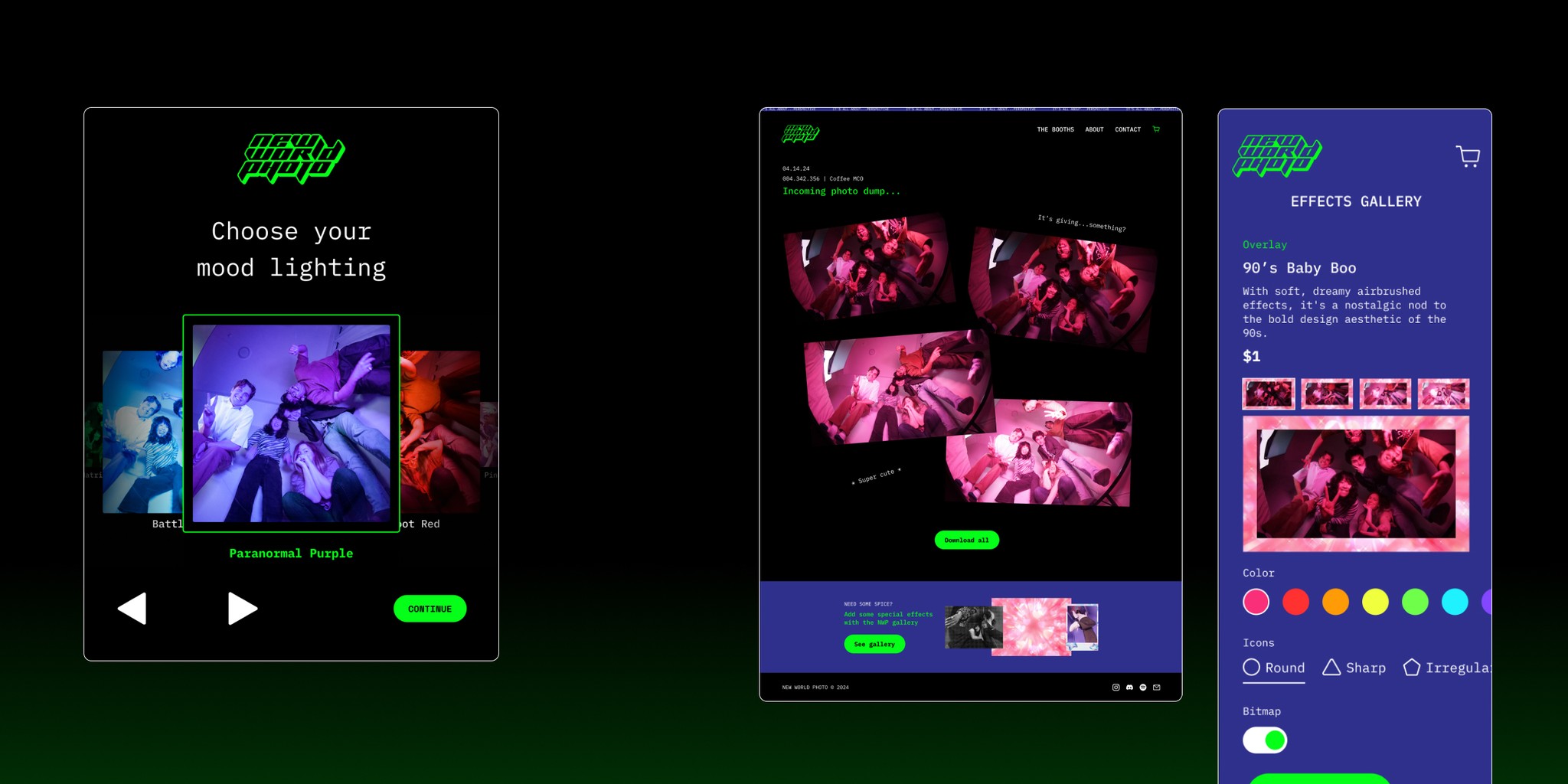
New World Photobooth
Reimagining the photobooth experience
MY ROLE
Product Designer
TOOLS
Figma
COMPANY
New World Photo
BACKGROUND
Elevating the photobooth space
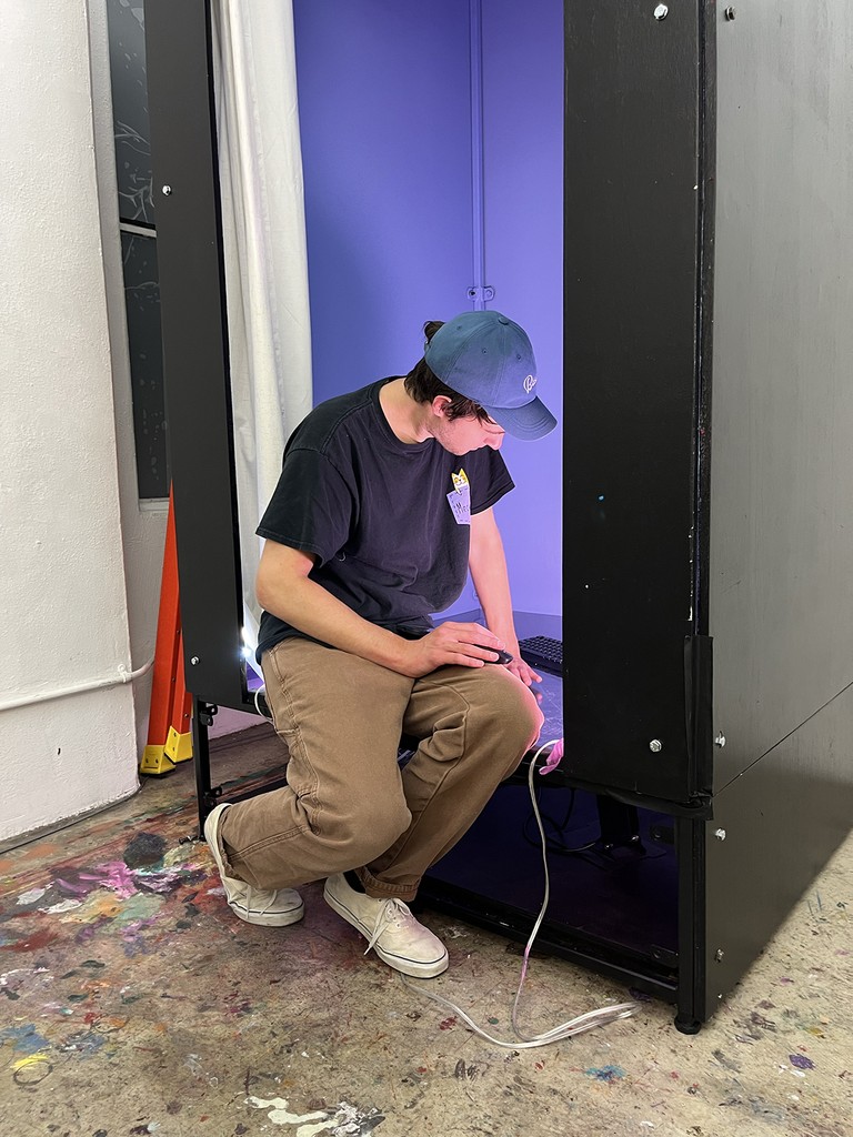
New World Photo is an LA-based company specializing in experiential installations. They came to me with a new project: help them design the user experience for their newest photobooth offering. They had the basic prototype built, but wanted an elevated experience for their users. They also had no company site and requested help crafting one.
The brief was clear—make it different from what other companies were offering. The only thing? We had a few weeks to get it all operational before it was needed for a demo.

COMPETITIVE ANALYSIS PT 1
What are other photobooth companies offering in their portfolios?
There is no shortage of other photobooth companies, especially in the SoCal area. I did an analysis of several of them, to see what they offered in terms of website and product portfolio.
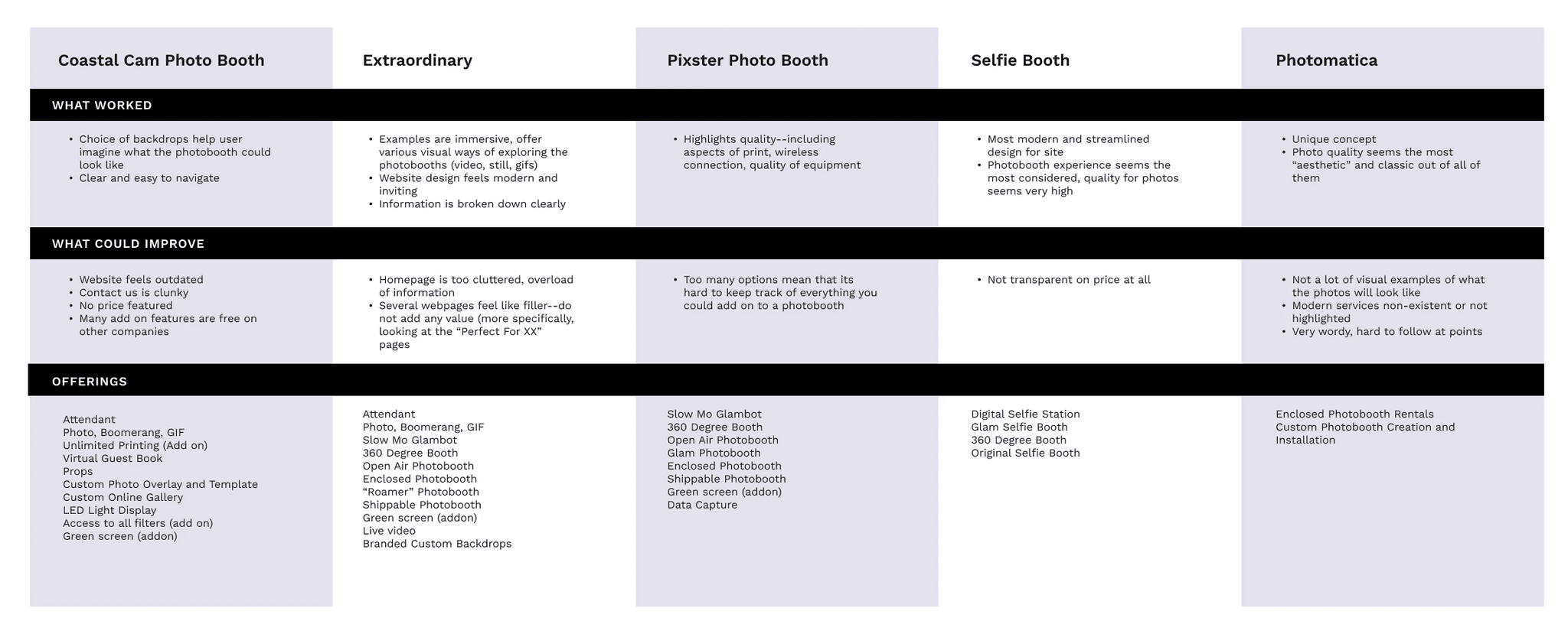
Overall many of them offered similar technology and had websites with little features. They had basic information on their products, and nothing additional beyond that. But that was only part one of competitive analysis.
COMPETITIVE ANALYSIS PT 2
What about the photobooths themselves?
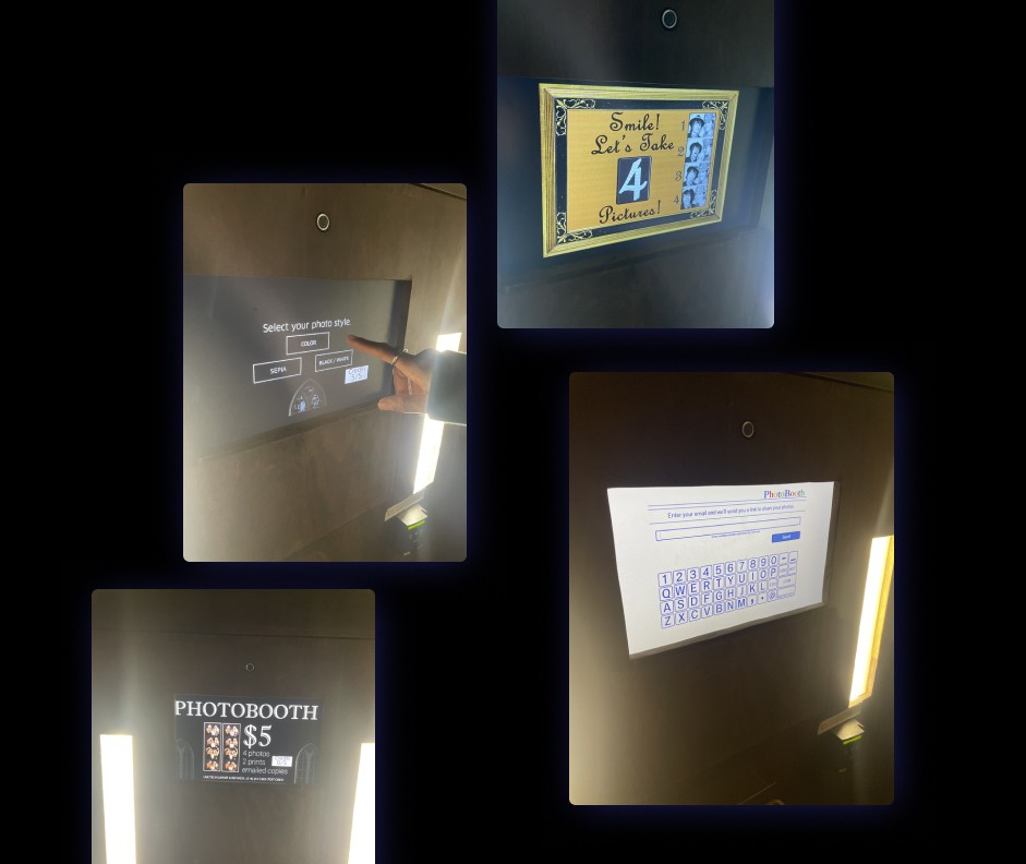
Since I was tasked with designing the website AND the kiosk experience, I needed to check out other photobooths in person to see how they handled the actual photo-taking process. I visited several over the course of the project, documenting and analyzing design patterns present. The majority of booths had extremely simple setups—sometimes they were no more than an email input field and request for payment. There was clearly a lot of space to play around with when it came to the overall UX AND UI design.
USER INTERVIEWS
Photo-taking and the fun of a photobooth
I had covered research on the physical nature of the photobooth, but I wanted to dive into the personal experience of using photobooths. I created a series of questions focused on people's experiences with using photobooths. The insights were suprisingly touching and illuminating.
The importance of mementos
The physical photos themselves were secondary to the memories associated with them. Interviewees talked fondly about the times they had taken photos, often remembering in detail when and where the photos themselves were taken. The physical photos themselves were emblematic of a larger emotional experience they had shared.
Groups: making memories…together
Interviewees often noted the fun of a photobooth was due to the group nature of the activity. Regardless of whether or not they were memorializing a special occasion, people reported the joy of creating new memories with a group.
Features and add-ons: unexpected, but appreciated
Interviewers noted that many of the photobooths they interacted with were often very simple, which was something they didn't mind. Any small touches—such as especially flattering lighting, thoughtful borders, or additional features—were often appreciated.
Striking a pose
All interviewees touched upon the fun of finding the right pose in a photobooth. It's a space where people could flex their creativity, incorporating props, expressions, and (of course) the right pose to capture the moment in time.
USER PERSONA
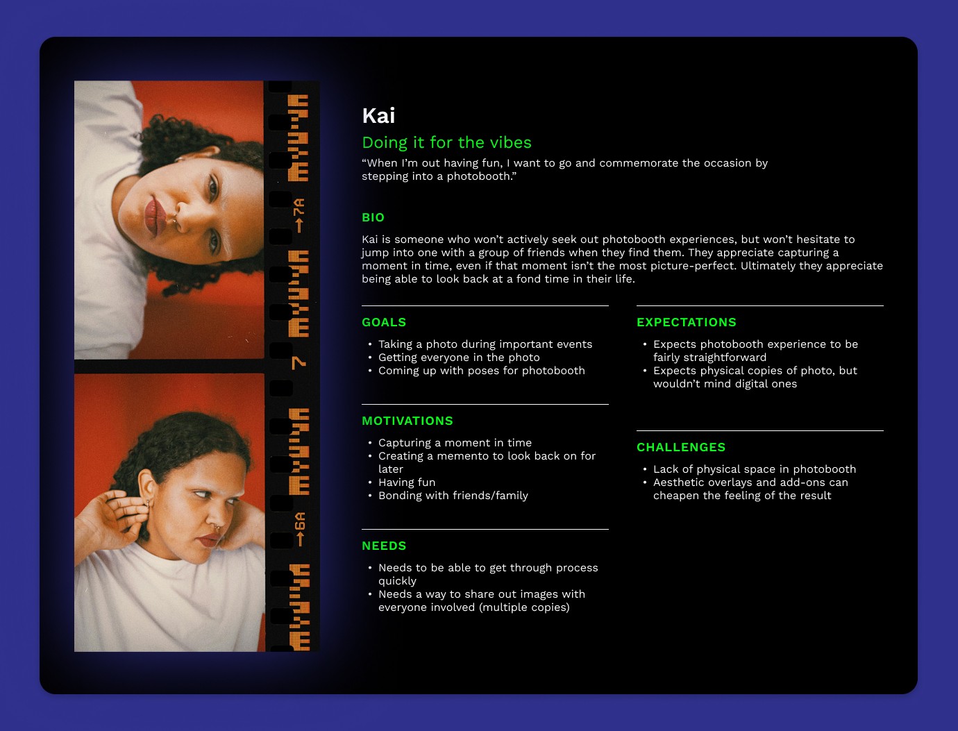
Doing it for the vibes
From the insights gathered, I created a user persona to help guide my design directions.
IDEATION
How might we create a unique photobooth experience that stands out from the rest?
I had my research, but now we needed to shape the actual experience. The developers were open to any ideas, so I knew I had space to play around with. Keeping in mind some themes from my research (making memories, the fun of groups, striking poses, special features) lead to the following ideas:
⬆️⬇️
POV Screen
The fun aspect of the booth is that it can shoot from below, due to an acrylic floor. I pitched adding an additional vantage point from the top, and allowing for the user/group to select which angle they'd like to choose from
🕺🏼
Pose Gallery
Interviewees noted how important it was to get the right pose, so I proposed a "pose gallery": it would offer examples of cool poses and allow the user/group to practice before moving on to the rest of the selections
🌈
Custom Lighting Selection
Other photobooths pitch "flattering" lighting, but this one could stand out by offering custom lighting, to be chosen by the user of the booth. The photobooth prototype used LED strips, and could be programmed to any color
⏳
Hurry Up Screen
In order to limit time in the booth, I proposed a cheeky "hurry up" screen that would display if users stayed too long on one particular section. The goal is not to make the image perfect: its to make memories!
🖼️
Effect Gallery
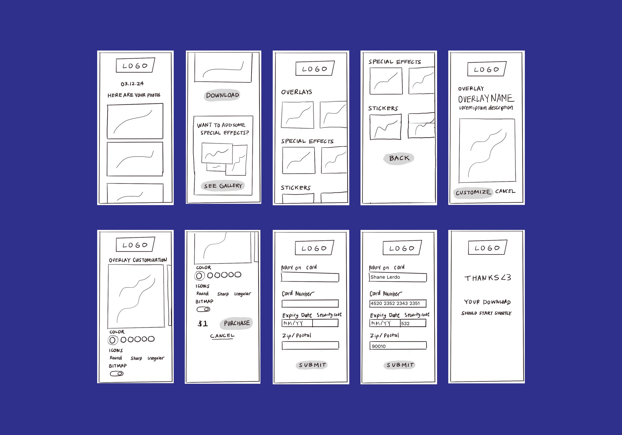
The developers wanted to offer add-ons such as filters, stickers, and overlays. I proposed an effect gallery on the website, to allow users to upgrade their photos at will
🎞️
Custom Prints
As opposed to the regular photo strips other booths offered, I pitched printing with special paper. In my research I had discovered some japanese and korean style photobooths offered options with transparency, sticker backing, and more
MECHANICS
How are we actually doing this, though?
Despite all the ideas, we also had to settle on the actual mechanical set up. An app would be too time-intensive, so it had to be web-based.
The developers pitched having the entire experience controlled by one mobile device, with a larger tablet for viewing only.
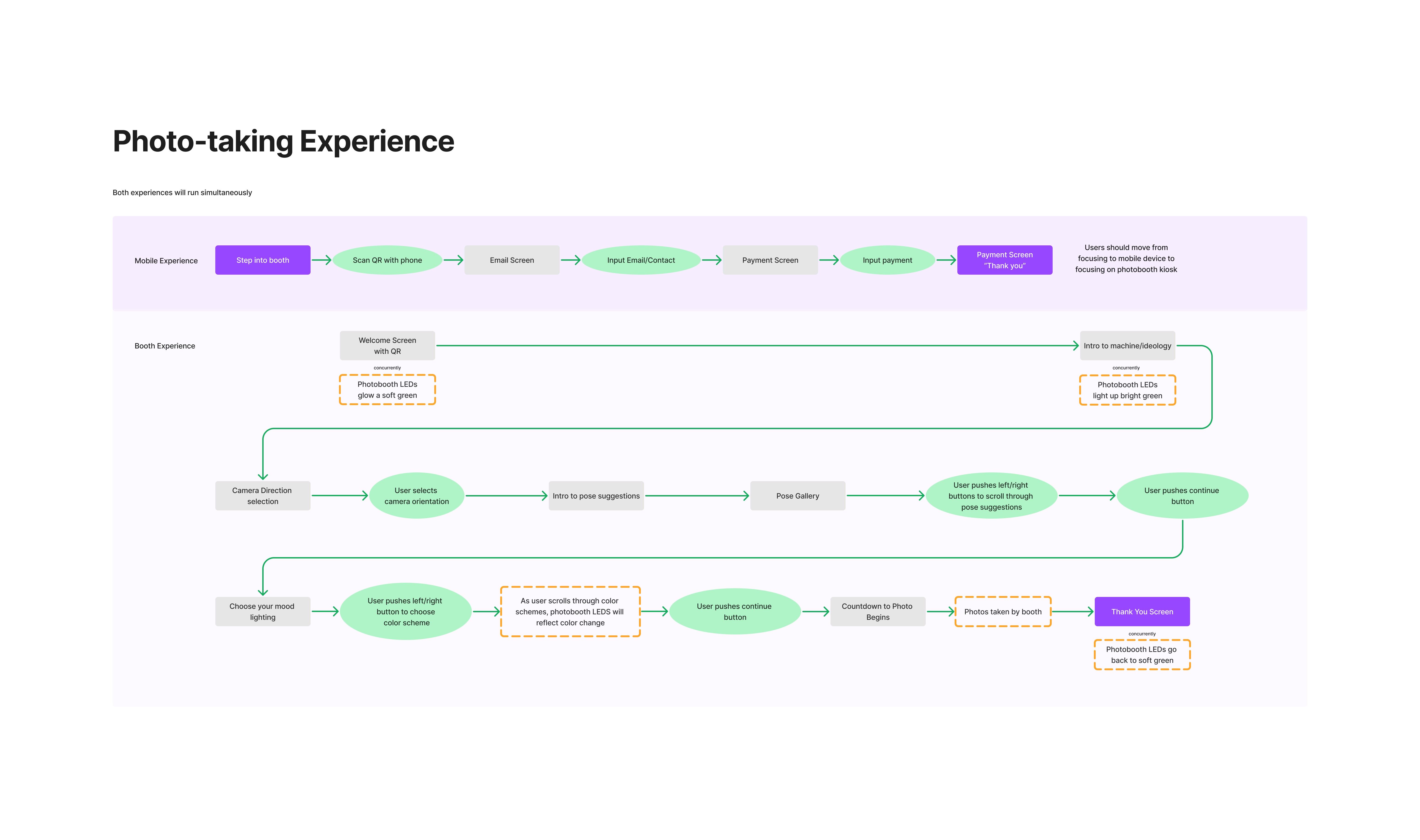
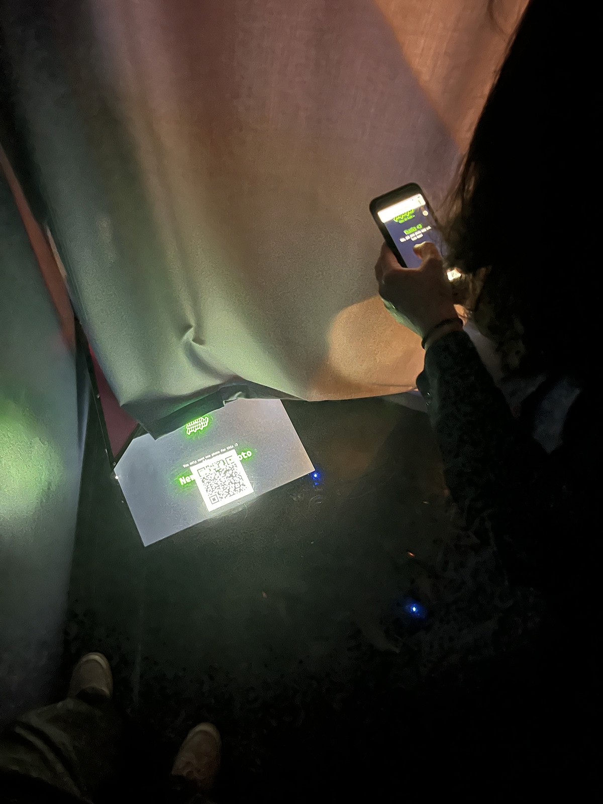
Based on my research, I recommended against the sole mobile approach. Groups were such a big draw in research, so I pitched the mobile as a starting point: users could scan a QR code on screen and submit payment. After that, the larger tablet would lead the user/group through the process of taking photos. Later on, a link with photos could be sent to the email or number inputted. That would be accessible via a mobile device or desktop computer. It meant there were a couple of different flows to design for, but they were up for the challenge.
INFORMATION ARCHITECTURE
Setting the stage
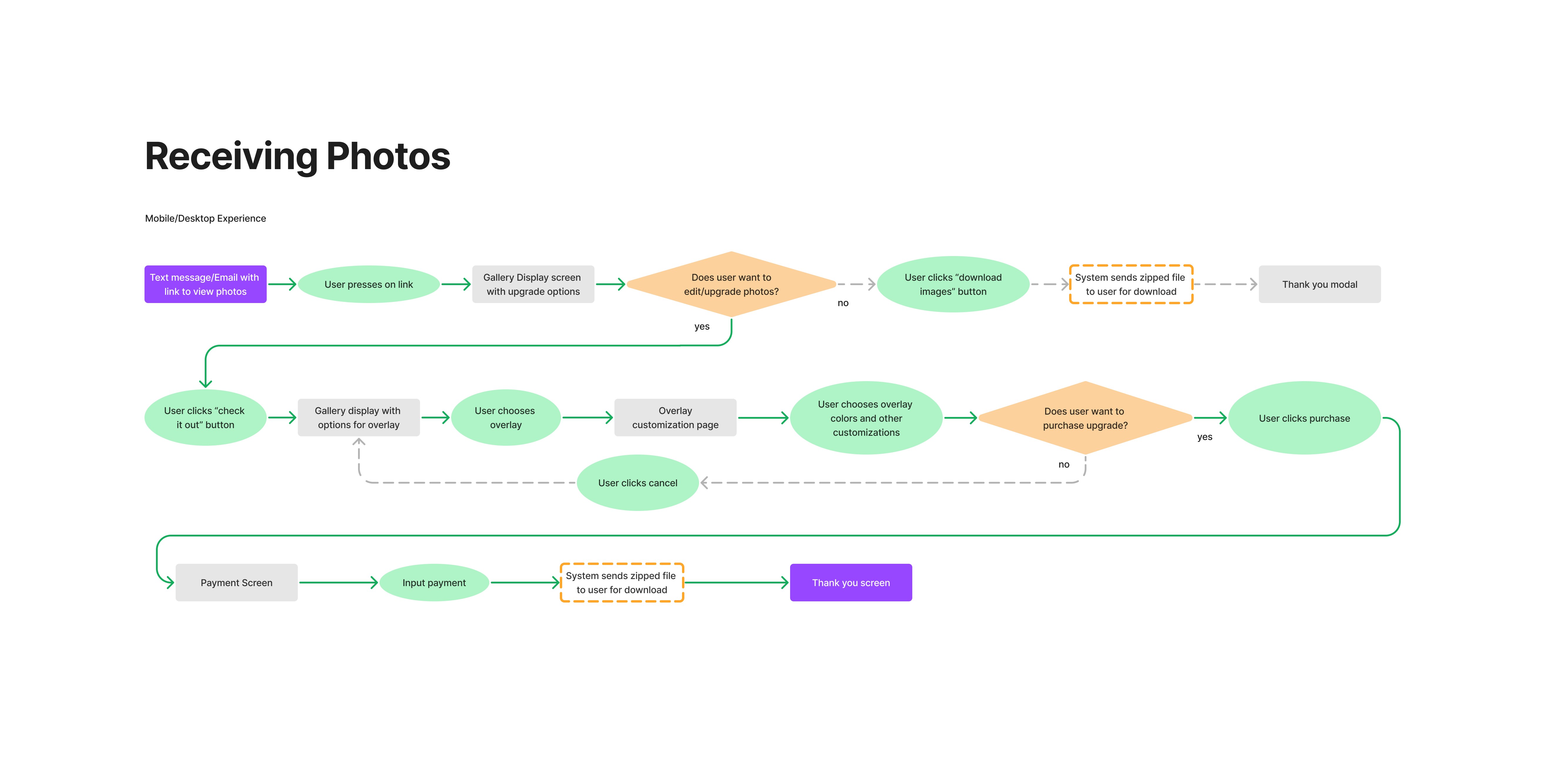
I created two sets of user flows for the process: taking the photos AND receiving the photos. This was a product I was helping to build from scratch, so I needed to make sure me and the developers were on board with every step of the journey.
LO-FI WIREFRAMES
Getting sketchy with it
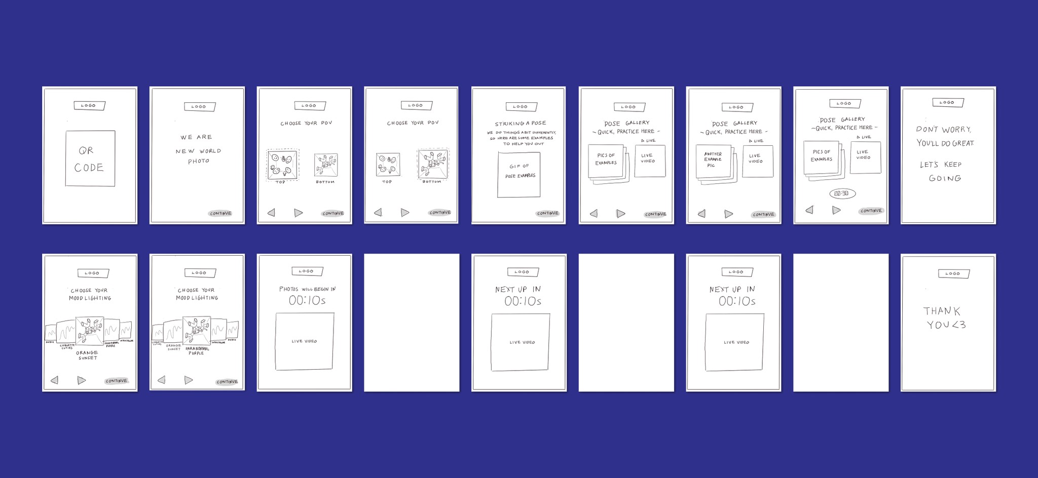
WIth the task flows guiding my design choices, I sketched out a few prototypes. The aim of this part of the process was to quickly iterate on my key screens in order to move on to testing.
Photo-Taking Flow: Payment
This flow took place primarily on a users mobile device, but could also be adapted for tablet (for the dads that use their tablet as their phone)

Photo-Taking Flow: Selection and Execution
This flow took place primarily on a tablet sized screen within the photobooth, and is the primary site of interaction.
Some details:
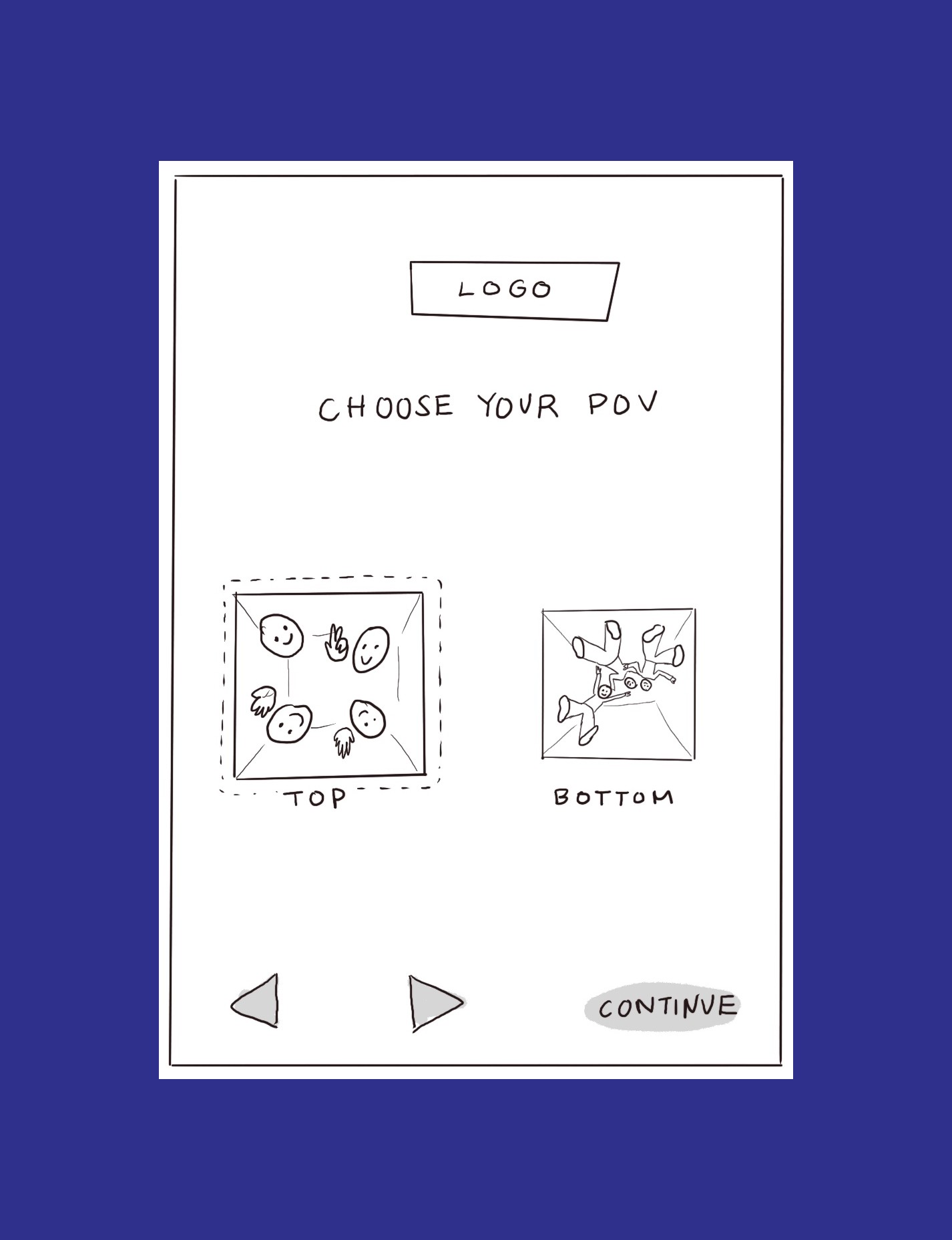
POV Screen
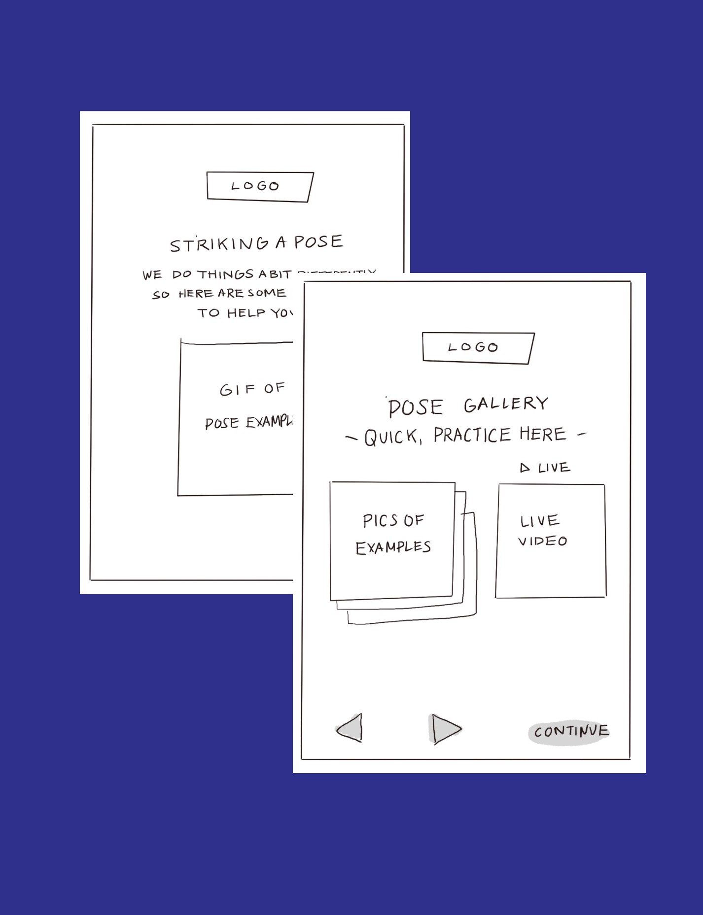
Pose Gallery
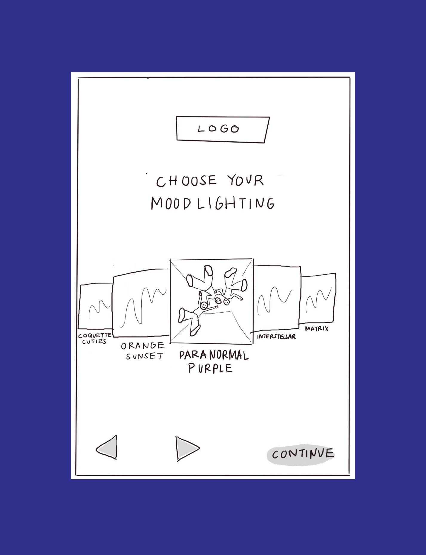
Mood Lighting
Photo-Receiving Flow
This flow took place primarily on a mobile device, but we also accounted for users opting to get the picture on their desktop.
TESTING AND ITERATION
User feedback
After sharing the lo-fi prototypes for reviews, users had some points of friction. I took the most common issues and adjusted my prototypes to account for the solutions.
Payment Feedback
🔘
Users wanted an option for submitting a phone number in addition to email
🔘
Users wanted to see price before inputting any additional information
Photo-taking Feedback
🔘
Some users wished they could have seen examples of the images so that they were aware of the capabilities of the machine
🔘
Some users understood pose gallery, but weren’t sure what the following “quick practice” screen was for
🔘
The “live video” was confusing for some, thought it was a livestream
Photo-Receiving Feedback
🔘
Overall users understood how to receive their photos
🔘
Some users were confused about what exactly the Effect Gallery was
🔘
Despite confusion, users were open to exploring the additional overlays
HI FI PROTOTYPES
Putting it all together
After talking with the developers, we felt that much of these could be solved with the addition of copy. Copy could be easily swapped out, so with our deadline in mind, I created my screens in hi-fidelity for user testing.
Payment Process
Photo-Taking Process
Photo-Receiving Process: Mobile
Photo-Receiving Process: Desktop
LAST MINUTE DECISIONS
Turning on a dime
With demo day approaching, everyone decided certain features had to be cut—namely the LED and POV camera selection. The development time would just be too much. After rearranging the flows, we agreed it could all work.
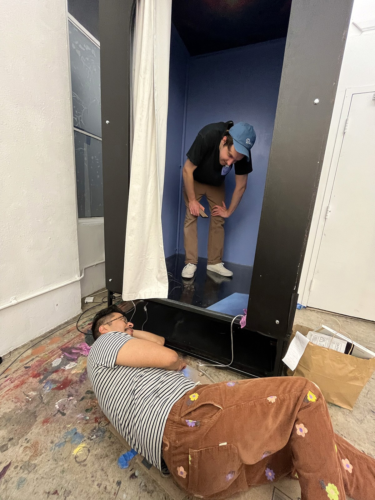
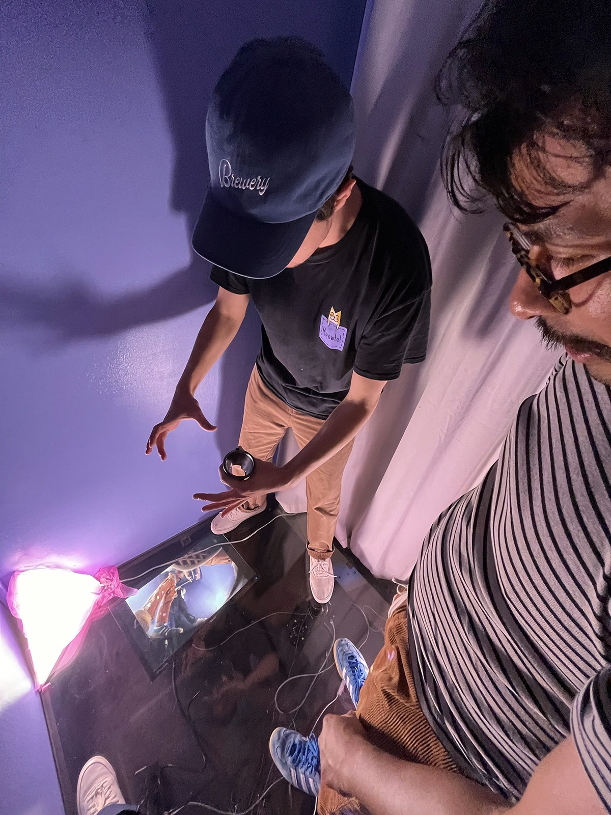
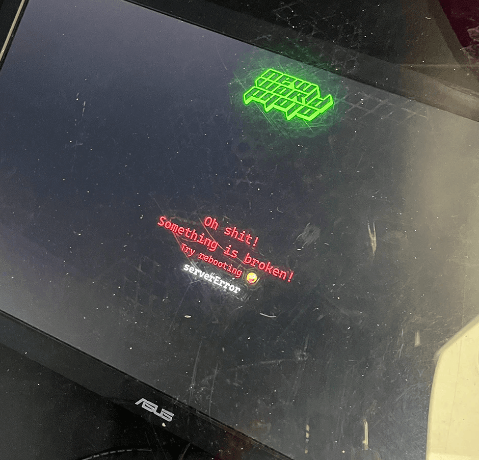
Because budget was limited, the purchase of an iPad as display had to be put off—all user navigation would now be timed, and there wasn't any room for error. We also had to switch to the desktop version of the photo-taking experience to account for the new viewport. Everyone stayed up late the night before helping to debug and solve errors.
DEMO DAY
Stress testing
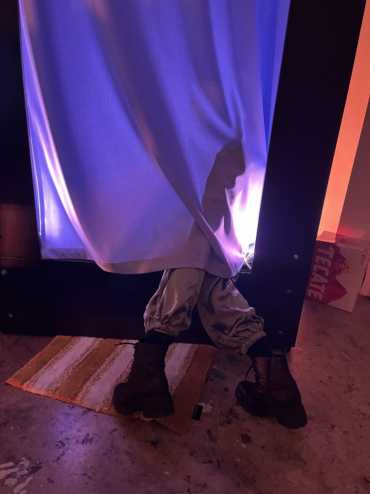
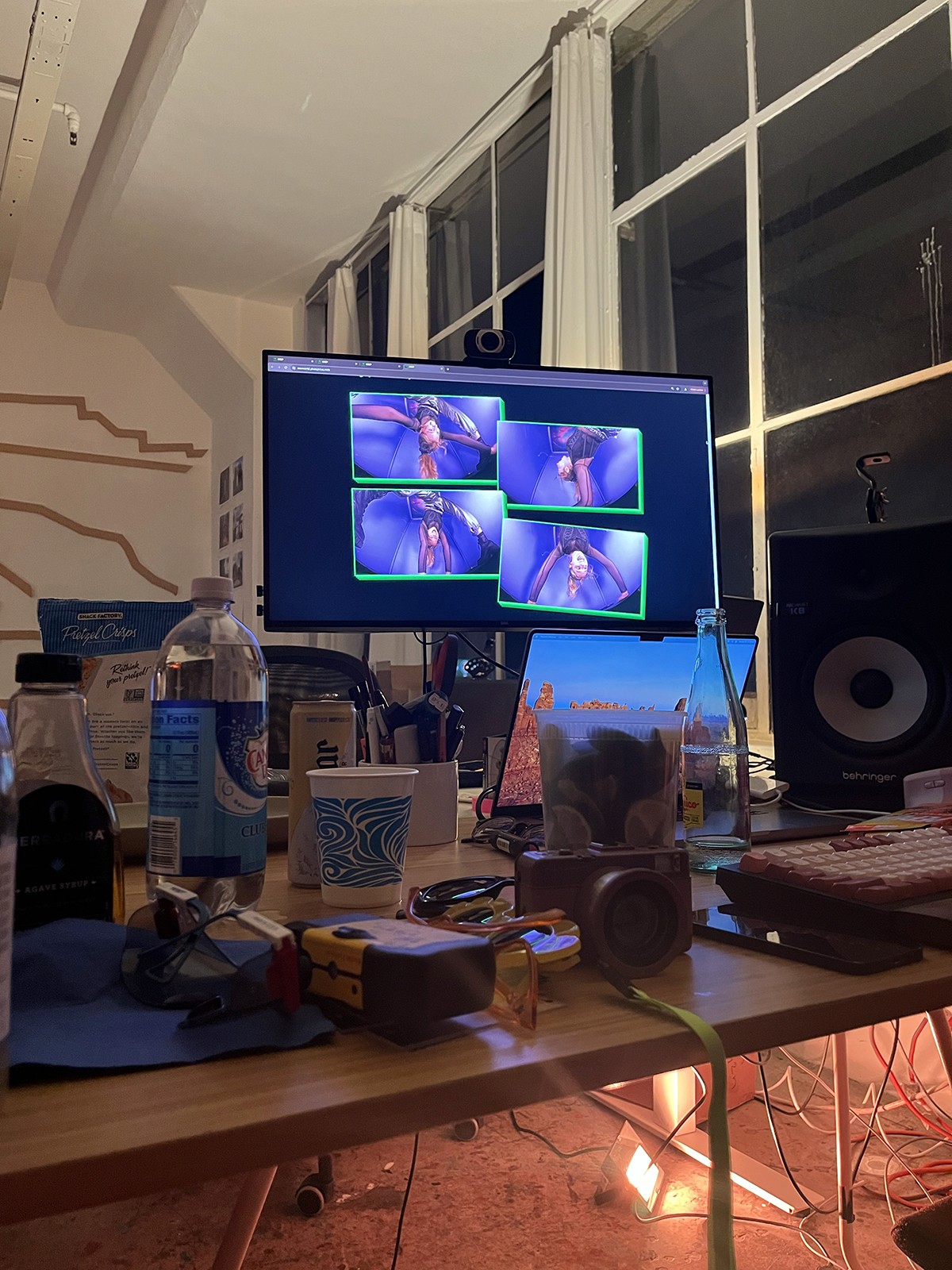
At last, demo day was here. After setting up, the ultimate user testing was conducted: people were invited in to the studio space to try out a free photobooth. Users of all kinds ended up hopping in. We evaluated how they moved through the process with little input besides "step in the booth and try it out!"
I followed up with users afterwards to get data on how they experienced the entire process, from beginning to end.
Users reported delight at the process, noting it was extremely simple to get the photobooth running and ready to go. The photo retrieval process was reported as similarly easy-to-use and understand—no one had questions on how to retrieve their photos or what they could do with them.
FOR THE FUTURE
With a more beef-ed up scope…
The founders are planning to build out the NWP Effect Gallery with more time and budget. Additionally, they expect to revisit the in-booth experience and transition to a tablet based kiosk that allows for more interaction. Overall, the next steps are to continue refining the experience for their eventual debut.
Back to projects
